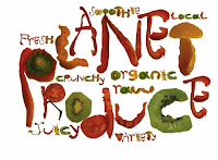
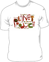
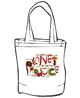
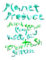
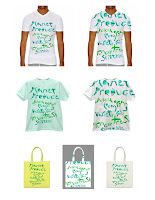
We took our edible alphabets and created graphics for the independent green grocer Planet Produce.
Here are the results:

Becca Mullineux


Stacey Montebello


Nora Truskey


Nicole Mueller


Minjie Yoo


Kate Guthrie

Hannah Trieb


Jiah Suh


Alex Lasher
Chelsea Soisson

Annalise Olson


Eve Mobley

Gabriela Gonzalez
Next Assignment: Words on Wheels 2011
Deadline: Final output due March 3rd at 3pm / Illustration Office for jurying. The winning
poem art will be selected by jury on March 6th and winners notified. Winners must submit their corrected files on a CD with your name, phone number and email address by March 9th to the Illustration Office.
Winning Poem Final Print: at full size, trimmed to 10 7/8” high x 27 1/2” wide including
the side banner. Pls use the ArtTech Lab. Your print out will have a bleed on it, pls trim this off.
Don’t submit with crops showing or with white border.
Final Art Requirements: The artwork you make needs to include a bleed on the top, left and
bottom. The art needs to be prepared at 11 1/8” high x 21 3/8” wide, or to that proportion.
The bleed area will be cut off. Also plan your composition so that nothing important falls within ½”
of the top and bottom of the panel. Metal rails hold the poster in place and would hide anything
in this area. See Design Requirements for additional info.
We should be able to read both the poem and the image in unison and
visual harmony. Leave room in your composition to make the poem easy
to read!
Files in the Words on Wheels folder that you will receive at the InDesign tutorial or go to Lynda.com
to create your file.
Things you’ll find:
• Fonts folder: Has all the fonts you will need. Must be included in your project folder. Pls check th computer you are on to make sure it has the SAME fonts. If it doesn’t, go to your Application folder on your Hard Drive, open it and look for the folder called Fonts. Highlight the new fonts and drag them into your computers Fonts folder. Close the windows and restart your computer to install them.
• Links folder: Has all the logos on the black bar. Must be included in your project folder.
When you place your Artwork [saved as a CMYK .tiff at 300dpi] into the poster file, you will be instructed to package it which will place your Artwork in this Links folder where it needs to be.
• InDesign file: A file in which you place your image and layout the poem using text windows [T tool]. You will need to use this file on a computer with the InDesign application loaded on it. All studio lab computers at MICA have this application as well as. You will need to save your final file down to CS3 for the MTA printer. They do not have CS4 or CS5.
• WoW poster pdf: Print out this reduced size file and use for sketching.
Design Requirements:
• Fonts: All poems MUST use only Helvetica Neue Light & Bold.
Italic can only be used if the poet uses it.
• The integrity of the poems structure must be maintained
• Final art needs 1/8” bleed on top, bottom & left side
• Black banner must be on right side
• Poster includes Title of Poem, Poem, Author/Grade/School/Teacher credit [keep format]
• MICA student credit must be run at right side of art with the baseline ¼” from black banner
in 9pt caps Helvetica Neue [in black or reversed out as white in bold] as follows:
ILLUSTRATION & DESIGN: JANE DOE / MICA ’12 [ or your graduation year]
Making your sketches:
Start by printing out the pdf file to “fit media”. This will shrink the large file to fit 8.5x11” paper
and give you the black banner. You can make as many of these as you need and draw sketches
on it, or sketch elsewhere and photocopy [enlarge or reduce] to make your image. Using this
pdf will help you create an image that fits the poster image shape.
As you sketch, have your poem nearby and remember that you must allow space in the composition
for the poem. You can mock up the poem by using handwritten block letters OR print out your
poem file, reduce it on a copier and to tape in place while sketching.
Use a photocopier to enlarge your sketch to the final poster size. Look at your sketches at a
distance. This is the way they will be seen on transit buses & LightRail cars.
Making your final art:
Get feedback on your sketches before going to final, then create your final art in the correct
proportion. Scan the final art to be 300dpi, CMYK to this size: 11 1/8” high x 21 3/8” wide.
This includes a 1/8” bleed on the left, top and bottom. This part of the image will be cut off so make sure it is not critical information.
If you file is not this proportion, then you have made the artwork at the wrong size.
Save your file as a .tiff, uncompressed. The file will be big. Color or contrast correct as needed.
Clean up any dust or other unwanted stuff on the file.
Save it and name it: YOUR FIRST INITIAL LAST NAME_NAME OF POEM in a folder with
your name on it on your CD or drive. Bring this to the class where we will do an InDesign
Workshop to put your image into the InDesign file.
Making your InDesign file:
1] Open the InDesign file in the Words on Wheels folder. Use the picture tool [in the tool bar,
it is the rectangle with an x thru it].
2] Make the picture box 11 1/8” high x 21 3/8” wide with the right edge lined up at the black banner. The window will hang 1/8” outside the document edge at the top, bottom and left.
3] Do a command+D to get a navigation window. Navigate to your image file and click “open”.
This will bring your image into the InDesign document. If you have made the Artwork the correct
size it will fit properly.
4] Make a type box using the “T” icon in the tool bar. Copy and paste your poem
from your Word doc of the poem. This will ensure there are no spelling errors. Put the title,
poem, author credit and your credit line in separate text boxes so they can be arranged
more easily.
Either make the type black or white, depending on your image. Colors in the type should be
used sparingly if at all.
5] Once you have all the poem copy in the type box [make sure the window is big enough to
read all the type], then select the type and change the font to Helvetica Neue and change the
weight [light or bold] and the point size. You may also wish to increase the letterspacing
somewhat [+25] in the menu window at the top where the AV with a double headed arrow
below it. At this point, you can move the type around until it works best with your image.
Remember, you sketched the poem into your image during the sketch stage, so use this
as a guide for the typeset font.
6] Save your Indesign file renaming it: YOUR FIRSTNAME&LASTNAME_WoW. The
application InDesign will add the suffix of .indd to your file.
7] IMPORTANT: To make sure you have all the necessary things to print [InDesign file,
image and fonts] go in the Menu Bar to File>Package. The first window allows you to add contact
info in case the printer has any questions. The next window names your packaged folder the same as your InDesign file and save to a destination of choice. Choose the desktop to make it easy to find.
Making your Print Out:
Burn your packaged folder onto a CD or drive and take it to the ArtTech Lab.
They will need to print it out on the large printer to get it full size. Printouts smaller than
full size will not be juried. You can save costs by printing out your file first on a smaller
printer by tiling the image and carefully connecting them together. The prints will need to carefully trimmed and carefully taped together on the back. Remember sloppy presentation
will detract from your submission. What you save in $$, you pay for in time.


